
VIVE
Church Website UX
Church Website UX
IA Architecture
Website UX/UI
Overview
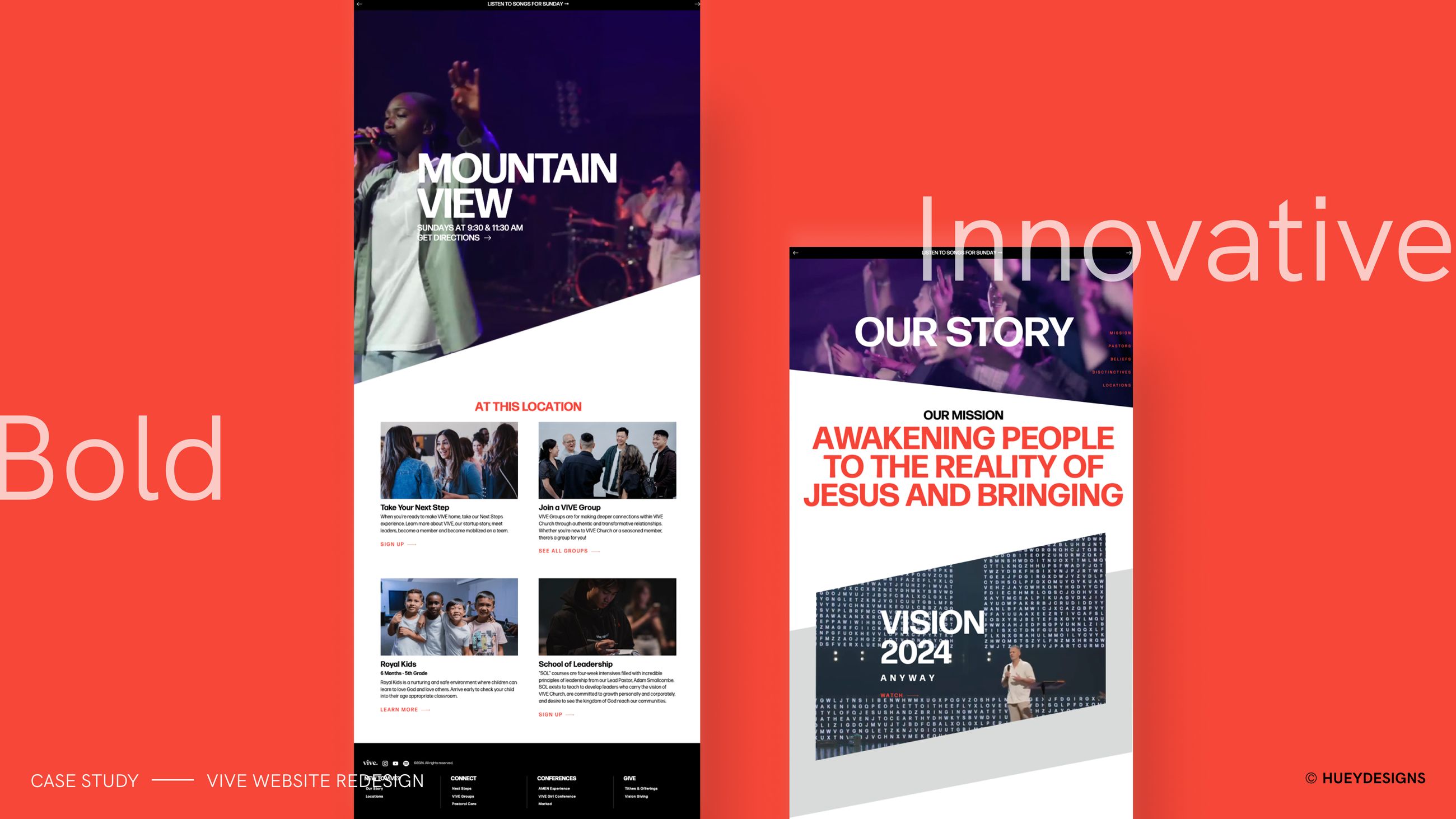
After 12 years of global expansion, the church needed a bold, innovative website that reflected its voice, mission, and standard of excellence—while giving staff an easier way to keep content fresh across locations. I led the full website redesign, rebuilding the information architecture and creating a scalable Webflow CMS experience that served both new visitors and existing members.
The Challenge
After 12 years of global growth, the church had expanded into a multi-location organization with a larger digital audience, more ministries, more events, and more content needs across campuses. The website needed to reflect the energy, excellence, and forward-thinking voice of the church while making the experience easier to navigate and maintain.
The challenge was twofold: create a bold digital front door for new visitors discovering the church for the first time, and build a flexible backend system that allowed staff to keep content fresh across locations, ministries, events, and resources without slowing down the organization.
What I Did
IA Architecture:
Rebuilt the information architecture around two primary audiences: new visitors looking for a forward-thinking church, and existing members needing quick access to locations, ministries, events, giving, and resources. I reorganized the navigation, page hierarchy, and content pathways so each audience could find the right next step faster.
Webflow CMS:
Created a scalable CMS structure in Webflow so church staff could update campuses, events, ministries, stories, and key content with less friction. The backend was designed to support fast updates and continued growth across locations.
Mobile-First Website UX:
Designed the experience mobile-first so visitors and members could quickly find information, sign up, give, and engage from the device they use most.
New Visitor Experience:
Designed a clear pathway for first-time visitors to understand the church’s mission, find a nearby location, learn about beliefs and story, and take a first step toward connection.
Member Experience:
Streamlined access to high-frequency actions for existing members, including locations, ministries, events, resources, giving, and participation opportunities.
Visual Direction & Design System:
Created a bold, modern visual direction and reusable website patterns, content sections, CTA treatments, navigation structures, and components to keep the experience consistent across pages and scalable for future growth.

Key Decisions
Design for two audiences.
The site needed to welcome people exploring the church for the first time while still helping members quickly access the actions they already knew they needed.
Make locations easy to find.
For a global, multi-campus church, campus discovery became a critical part of the experience. The site needed to help visitors quickly find where to attend and how to get connected locally.
Support content freshness.
The redesign was not only about the front-end experience. The CMS had to make updates simple so staff could keep locations, ministries, events, and resources current without creating operational drag.
Lead with boldness and trust.
The visual system needed to feel innovative, energetic, and aligned with the church’s voice while still creating clarity, credibility, and confidence for first-time visitors.
Connect mission to action.
Every major pathway—locations, connection, ministries, events, giving, and resources—was designed to help people move from inspiration to participation.
Core Product Flows
Discover — Visitors encounter the church’s mission, story, vision, and bold visual identity.
Locate — New visitors find a nearby campus and understand how to attend.
Connect — People take a next step through connection pathways, ministries, events, and resources.
Engage — Members sign up, give, participate, and stay involved through streamlined site actions.
Update — Staff keep content fresh through a scalable Webflow CMS that supports ongoing growth.
Results
In the first 2 months after the redesign, the website showed strong growth across key engagement metrics:
Increased user engagement by 985%, showing that visitors were interacting more deeply with the new experience.
Attracted 49K new users, expanding the church’s digital reach and visibility.
Increased daily active users by 38%, indicating stronger repeat visitation and ongoing interest.
Achieved 30% month-over-month growth, showing continued momentum after launch.
Made it easier for new visitors to find nearby locations and connect with the church’s mission on the first visit.
Gave members a streamlined way to engage, sign up, give, and participate.
Strengthened trust and elevated the overall experience through bold visuals, clearer navigation, and a more polished digital presence.
Enabled faster staff updates through a simple backend built to support continued growth.
Reflection
This project reinforced that a church website has to work as both a digital front door and an operational platform. The redesign needed to inspire people with the church’s mission, guide visitors toward local connection, help members act quickly, and give staff a scalable system for keeping content fresh. The strongest design opportunity was connecting bold brand expression with practical content architecture so the website could support both the church’s voice and its continued growth.

View Next Project
VIVE
Church Website UX
IA Architecture
Website UX/UI
Overview
After 12 years of global expansion, the church needed a bold, innovative website that reflected its voice, mission, and standard of excellence—while giving staff an easier way to keep content fresh across locations. I led the full website redesign, rebuilding the information architecture and creating a scalable Webflow CMS experience that served both new visitors and existing members.
The Challenge
After 12 years of global growth, the church had expanded into a multi-location organization with a larger digital audience, more ministries, more events, and more content needs across campuses. The website needed to reflect the energy, excellence, and forward-thinking voice of the church while making the experience easier to navigate and maintain.
The challenge was twofold: create a bold digital front door for new visitors discovering the church for the first time, and build a flexible backend system that allowed staff to keep content fresh across locations, ministries, events, and resources without slowing down the organization.
What I Did
IA Architecture:
Rebuilt the information architecture around two primary audiences: new visitors looking for a forward-thinking church, and existing members needing quick access to locations, ministries, events, giving, and resources. I reorganized the navigation, page hierarchy, and content pathways so each audience could find the right next step faster.
Webflow CMS:
Created a scalable CMS structure in Webflow so church staff could update campuses, events, ministries, stories, and key content with less friction. The backend was designed to support fast updates and continued growth across locations.
Mobile-First Website UX:
Designed the experience mobile-first so visitors and members could quickly find information, sign up, give, and engage from the device they use most.
New Visitor Experience:
Designed a clear pathway for first-time visitors to understand the church’s mission, find a nearby location, learn about beliefs and story, and take a first step toward connection.
Member Experience:
Streamlined access to high-frequency actions for existing members, including locations, ministries, events, resources, giving, and participation opportunities.
Visual Direction & Design System:
Created a bold, modern visual direction and reusable website patterns, content sections, CTA treatments, navigation structures, and components to keep the experience consistent across pages and scalable for future growth.
Key Decisions
Design for two audiences.
The site needed to welcome people exploring the church for the first time while still helping members quickly access the actions they already knew they needed.
Make locations easy to find.
For a global, multi-campus church, campus discovery became a critical part of the experience. The site needed to help visitors quickly find where to attend and how to get connected locally.
Support content freshness.
The redesign was not only about the front-end experience. The CMS had to make updates simple so staff could keep locations, ministries, events, and resources current without creating operational drag.
Lead with boldness and trust.
The visual system needed to feel innovative, energetic, and aligned with the church’s voice while still creating clarity, credibility, and confidence for first-time visitors.
Connect mission to action.
Every major pathway—locations, connection, ministries, events, giving, and resources—was designed to help people move from inspiration to participation.
Core Product Flows
Discover — Visitors encounter the church’s mission, story, vision, and bold visual identity.
Locate — New visitors find a nearby campus and understand how to attend.
Connect — People take a next step through connection pathways, ministries, events, and resources.
Engage — Members sign up, give, participate, and stay involved through streamlined site actions.
Update — Staff keep content fresh through a scalable Webflow CMS that supports ongoing growth.
Results
In the first 2 months after the redesign, the website showed strong growth across key engagement metrics:
Increased user engagement by 985%, showing that visitors were interacting more deeply with the new experience.
Attracted 49K new users, expanding the church’s digital reach and visibility.
Increased daily active users by 38%, indicating stronger repeat visitation and ongoing interest.
Achieved 30% month-over-month growth, showing continued momentum after launch.
Made it easier for new visitors to find nearby locations and connect with the church’s mission on the first visit.
Gave members a streamlined way to engage, sign up, give, and participate.
Strengthened trust and elevated the overall experience through bold visuals, clearer navigation, and a more polished digital presence.
Enabled faster staff updates through a simple backend built to support continued growth.
Reflection
This project reinforced that a church website has to work as both a digital front door and an operational platform. The redesign needed to inspire people with the church’s mission, guide visitors toward local connection, help members act quickly, and give staff a scalable system for keeping content fresh. The strongest design opportunity was connecting bold brand expression with practical content architecture so the website could support both the church’s voice and its continued growth.
View Next Project
VIVE
Church Website UX
IA Architecture
Website UX/UI
Overview
After 12 years of global expansion, the church needed a bold, innovative website that reflected its voice, mission, and standard of excellence—while giving staff an easier way to keep content fresh across locations. I led the full website redesign, rebuilding the information architecture and creating a scalable Webflow CMS experience that served both new visitors and existing members.
The Challenge
After 12 years of global growth, the church had expanded into a multi-location organization with a larger digital audience, more ministries, more events, and more content needs across campuses. The website needed to reflect the energy, excellence, and forward-thinking voice of the church while making the experience easier to navigate and maintain.
The challenge was twofold: create a bold digital front door for new visitors discovering the church for the first time, and build a flexible backend system that allowed staff to keep content fresh across locations, ministries, events, and resources without slowing down the organization.
What I Did
IA Architecture:
Rebuilt the information architecture around two primary audiences: new visitors looking for a forward-thinking church, and existing members needing quick access to locations, ministries, events, giving, and resources. I reorganized the navigation, page hierarchy, and content pathways so each audience could find the right next step faster.
Webflow CMS:
Created a scalable CMS structure in Webflow so church staff could update campuses, events, ministries, stories, and key content with less friction. The backend was designed to support fast updates and continued growth across locations.
Mobile-First Website UX:
Designed the experience mobile-first so visitors and members could quickly find information, sign up, give, and engage from the device they use most.
New Visitor Experience:
Designed a clear pathway for first-time visitors to understand the church’s mission, find a nearby location, learn about beliefs and story, and take a first step toward connection.
Member Experience:
Streamlined access to high-frequency actions for existing members, including locations, ministries, events, resources, giving, and participation opportunities.
Visual Direction & Design System:
Created a bold, modern visual direction and reusable website patterns, content sections, CTA treatments, navigation structures, and components to keep the experience consistent across pages and scalable for future growth.
Key Decisions
Design for two audiences.
The site needed to welcome people exploring the church for the first time while still helping members quickly access the actions they already knew they needed.
Make locations easy to find.
For a global, multi-campus church, campus discovery became a critical part of the experience. The site needed to help visitors quickly find where to attend and how to get connected locally.
Support content freshness.
The redesign was not only about the front-end experience. The CMS had to make updates simple so staff could keep locations, ministries, events, and resources current without creating operational drag.
Lead with boldness and trust.
The visual system needed to feel innovative, energetic, and aligned with the church’s voice while still creating clarity, credibility, and confidence for first-time visitors.
Connect mission to action.
Every major pathway—locations, connection, ministries, events, giving, and resources—was designed to help people move from inspiration to participation.
Core Product Flows
Discover — Visitors encounter the church’s mission, story, vision, and bold visual identity.
Locate — New visitors find a nearby campus and understand how to attend.
Connect — People take a next step through connection pathways, ministries, events, and resources.
Engage — Members sign up, give, participate, and stay involved through streamlined site actions.
Update — Staff keep content fresh through a scalable Webflow CMS that supports ongoing growth.
Results
In the first 2 months after the redesign, the website showed strong growth across key engagement metrics:
Increased user engagement by 985%, showing that visitors were interacting more deeply with the new experience.
Attracted 49K new users, expanding the church’s digital reach and visibility.
Increased daily active users by 38%, indicating stronger repeat visitation and ongoing interest.
Achieved 30% month-over-month growth, showing continued momentum after launch.
Made it easier for new visitors to find nearby locations and connect with the church’s mission on the first visit.
Gave members a streamlined way to engage, sign up, give, and participate.
Strengthened trust and elevated the overall experience through bold visuals, clearer navigation, and a more polished digital presence.
Enabled faster staff updates through a simple backend built to support continued growth.
Reflection
This project reinforced that a church website has to work as both a digital front door and an operational platform. The redesign needed to inspire people with the church’s mission, guide visitors toward local connection, help members act quickly, and give staff a scalable system for keeping content fresh. The strongest design opportunity was connecting bold brand expression with practical content architecture so the website could support both the church’s voice and its continued growth.
View Next Project