
Broadcom xFlow
Broadcom xFlow
Simplifying High-Volume IT Service Workflows
Simplifying High-Volume IT Service Workflows
SaaS IT Analyst Platform
Product UX/UI
Overview
Designing an intelligent UX to help IT analysts understand, prioritize, and decide faster
Broadcom xFlow is an enterprise IT service management application designed to help analysts triage, manage, and resolve service requests. I redesigned the core experience to make complex workflows easier for new users to learn and faster for experienced analysts to navigate.

The Challenge
Traditional service management tools often overwhelm analysts with dense interfaces, technical information, hidden actions, and complicated navigation.
New analysts needed guidance and a shorter learning curve. Experienced analysts needed faster access to information and frequently used actions. The organization needed greater efficiency without removing the advanced controls required for service work.
The challenge was to simplify the experience while preserving the depth required to manage high-volume, business-critical requests.
What I Did
Dashboard UX Redesign:
Reimagined the dashboard around analyst goals instead of system structure, making it easier to prioritize work, understand context, and take action.
Ticket Card Concept:
Designed a card-based ticket experience that shifted the interface from tracking tickets as rows to helping analysts understand and resolve customer issues faster.
Weather & Heat Concepts:
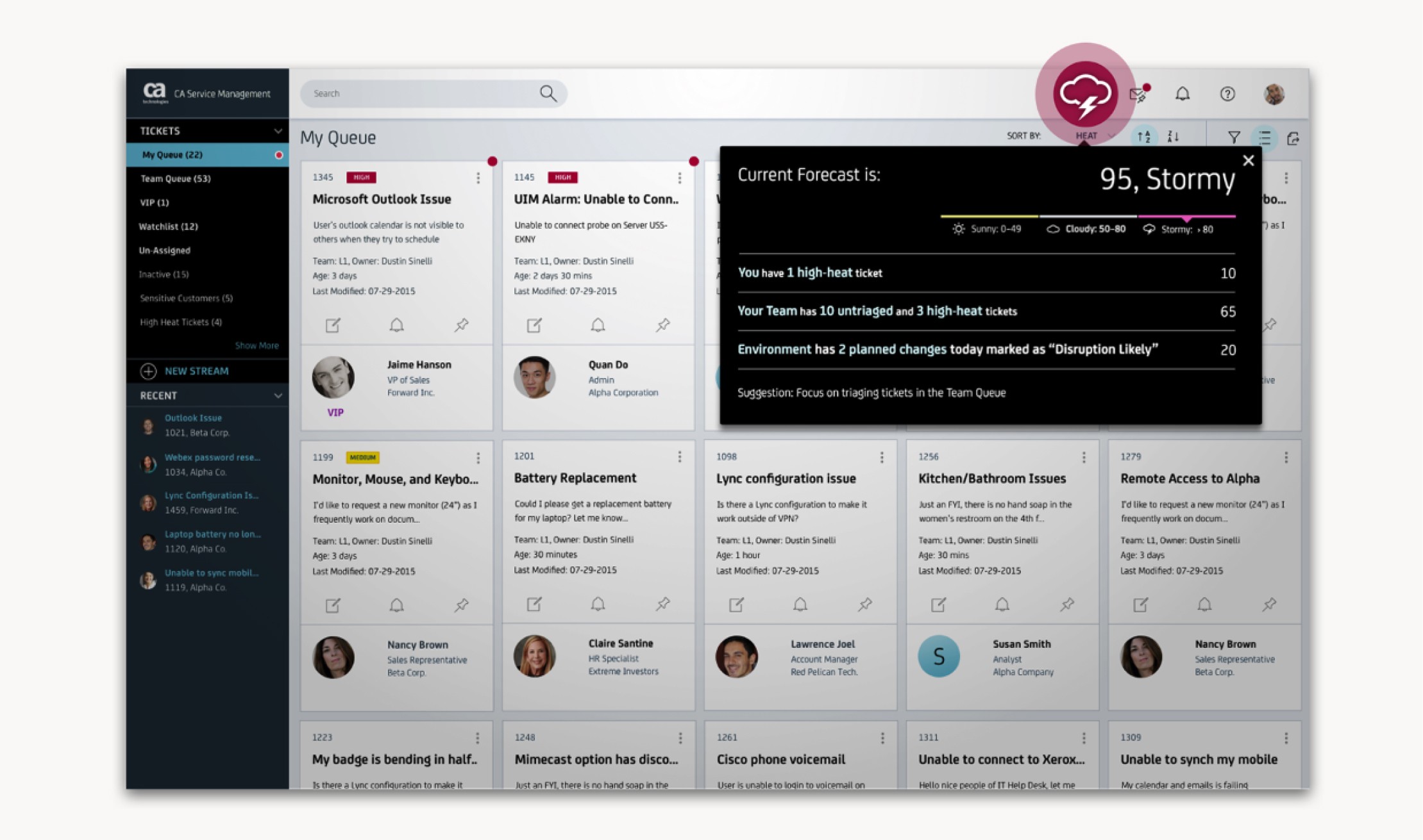
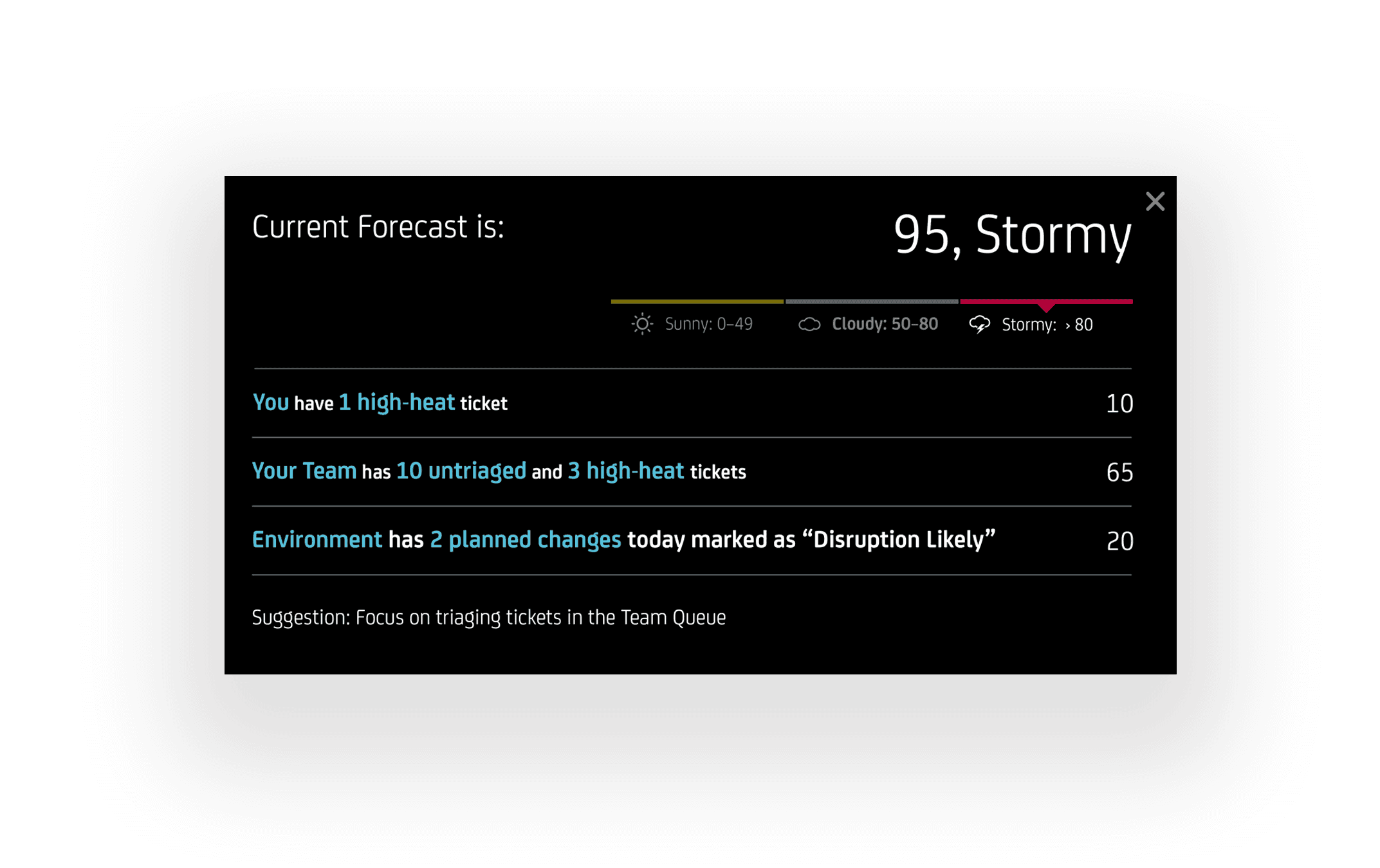
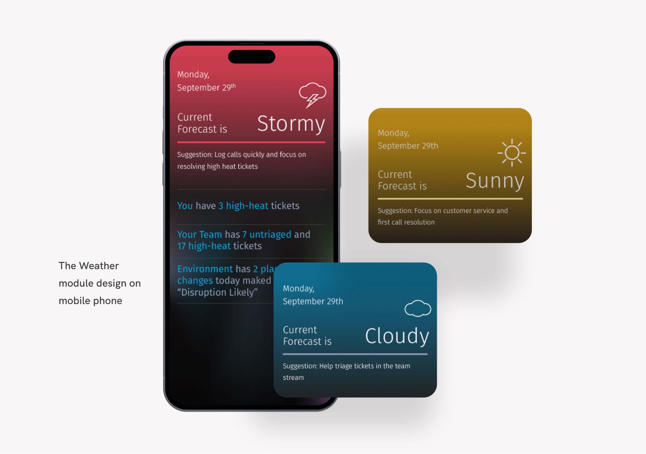
Created new prioritization models that translated queue, team, environment, SLA, and customer signals into clearer guidance for what needed attention first.
Workflow Strategy:
Reorganized the product around the analyst's decisions and tasks instead of underlying software architecture.
Prototyping & Validation:
Led ideation, revisited legacy concepts, ran a design sprint, narrowed multiple directions into the strongest concepts, and validated them with customers.
Design System:
Created reusable ticket card patterns, prioritization cues, icon-and-text treatments, and dashboard interaction standards to make the ITSM experience more consistent and scalable.


Key Decisions
Design for analyst behavior, not system structure.
The redesign focused on how analysts naturally decide what to work on, rather than forcing them to interpret dense ticket tables.
Shift from ticket tracking to customer resolution.
The ticket card concept gave analysts richer context and immediate actions without requiring them to drill into every ticket detail.
Make priority visible.
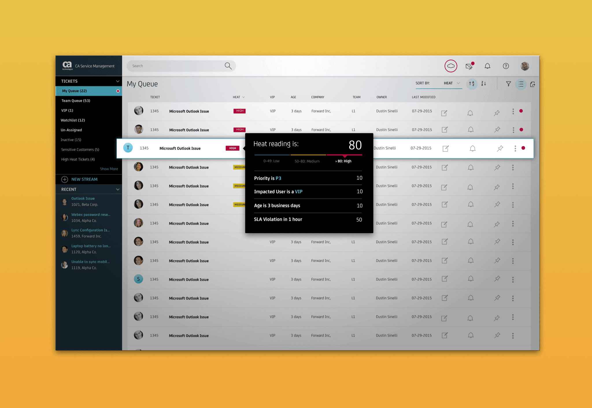
The Heat concept ranked tickets based on factors such as age, priority, SLA, VIP status, and organization-specific rules—helping the most important work rise to the top.
Turn operational noise into signal.
The Weather concept summarized what was happening across personal queues, team queues, and the broader environment so analysts could start the day with confidence and adapt as conditions changed.
Simplify complex data into clear cues.
After multiple iterations, I simplified confusing visualizations into a text-and-icon interface that made status and priority easier to understand at a glance.

Core Product Loop
Scan — Analysts review ticket cards, queue signals, and environment status.
Prioritize — Heat ranking surfaces the most important tickets first.
Understand — Weather and ticket context explain what is happening and why it matters.
Triage — The request is categorized, assigned, or escalated.
Act — Analysts take immediate action with fewer clicks and less context switching.
Communicate — Progress and status are updated for stakeholders.
Resolve — The request is completed and documented. Real-time updates and alerts help analysts adjust focus as priorities change.
Results
Helped launch the newly named CA xFlow experience.
Earned the 2016 ITSM Innovation of the Year recognition.
Achieved a strong usability score of 8.3/10 for ease of use.
Positive user feedback contributed to an NPS score of 8.5/10 in the first year.
Reduced training complexity by creating a more intuitive, context-rich dashboard.
Improved analyst confidence by making ticket priority, SLA risk, and customer context easier to understand.
This project reinforced that enterprise tools become more powerful when they align with how people actually work. Analysts did not need more data—they needed the right context at the right moment. By turning queues, SLAs, customer signals, and environmental changes into clear design cues, xFlow helped analysts focus on service outcomes instead of tool management.
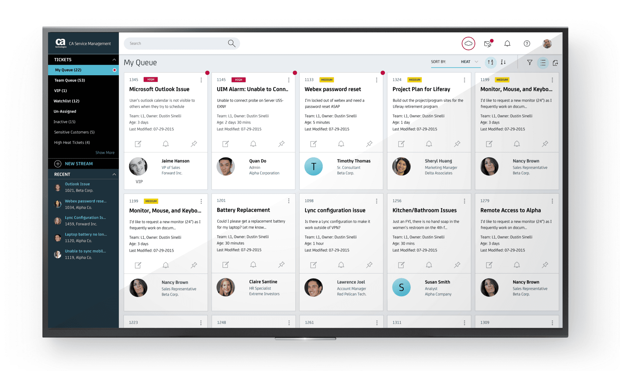
Card-based ticket design
Broadcom xFlow
Simplifying High-Volume IT Service Workflows
SaaS IT Analyst Platform
Product UX/UI
Overview
Designing an intelligent UX to help IT analysts understand, prioritize, and decide faster
Broadcom xFlow is an enterprise IT service management application designed to help analysts triage, manage, and resolve service requests. I redesigned the core experience to make complex workflows easier for new users to learn and faster for experienced analysts to navigate.
The Challenge
Traditional service management tools often overwhelm analysts with dense interfaces, technical information, hidden actions, and complicated navigation.
New analysts needed guidance and a shorter learning curve. Experienced analysts needed faster access to information and frequently used actions. The organization needed greater efficiency without removing the advanced controls required for service work.
The challenge was to simplify the experience while preserving the depth required to manage high-volume, business-critical requests.
What I Did
Dashboard UX Redesign:
Reimagined the dashboard around analyst goals instead of system structure, making it easier to prioritize work, understand context, and take action.
Ticket Card Concept:
Designed a card-based ticket experience that shifted the interface from tracking tickets as rows to helping analysts understand and resolve customer issues faster.
Weather & Heat Concepts:
Created new prioritization models that translated queue, team, environment, SLA, and customer signals into clearer guidance for what needed attention first.
Workflow Strategy:
Reorganized the product around the analyst's decisions and tasks instead of underlying software architecture.
Prototyping & Validation:
Led ideation, revisited legacy concepts, ran a design sprint, narrowed multiple directions into the strongest concepts, and validated them with customers.
Design System:
Created reusable ticket card patterns, prioritization cues, icon-and-text treatments, and dashboard interaction standards to make the ITSM experience more consistent and scalable.
Key Decisions
Design for analyst behavior, not system structure.
The redesign focused on how analysts naturally decide what to work on, rather than forcing them to interpret dense ticket tables.
Shift from ticket tracking to customer resolution.
The ticket card concept gave analysts richer context and immediate actions without requiring them to drill into every ticket detail.
Make priority visible.
The Heat concept ranked tickets based on factors such as age, priority, SLA, VIP status, and organization-specific rules—helping the most important work rise to the top.
Turn operational noise into signal.
The Weather concept summarized what was happening across personal queues, team queues, and the broader environment so analysts could start the day with confidence and adapt as conditions changed.
Simplify complex data into clear cues.
After multiple iterations, I simplified confusing visualizations into a text-and-icon interface that made status and priority easier to understand at a glance.
Core Product Loop
Scan — Analysts review ticket cards, queue signals, and environment status.
Prioritize — Heat ranking surfaces the most important tickets first.
Understand — Weather and ticket context explain what is happening and why it matters.
Triage — The request is categorized, assigned, or escalated.
Act — Analysts take immediate action with fewer clicks and less context switching.
Communicate — Progress and status are updated for stakeholders.
Resolve — The request is completed and documented. Real-time updates and alerts help analysts adjust focus as priorities change.
Results
Helped launch the newly named CA xFlow experience.
Earned the 2016 ITSM Innovation of the Year recognition.
Achieved a strong usability score of 8.3/10 for ease of use.
Positive user feedback contributed to an NPS score of 8.5/10 in the first year.
Reduced training complexity by creating a more intuitive, context-rich dashboard.
Improved analyst confidence by making ticket priority, SLA risk, and customer context easier to understand.
This project reinforced that enterprise tools become more powerful when they align with how people actually work. Analysts did not need more data—they needed the right context at the right moment. By turning queues, SLAs, customer signals, and environmental changes into clear design cues, xFlow helped analysts focus on service outcomes instead of tool management.
Card-based ticket design
Broadcom xFlow
Simplifying High-Volume IT Service Workflows
SaaS IT Analyst Platform
Product UX/UI
Overview
Designing an intelligent UX to help IT analysts understand, prioritize, and decide faster
Broadcom xFlow is an enterprise IT service management application designed to help analysts triage, manage, and resolve service requests. I redesigned the core experience to make complex workflows easier for new users to learn and faster for experienced analysts to navigate.
The Challenge
Traditional service management tools often overwhelm analysts with dense interfaces, technical information, hidden actions, and complicated navigation.
New analysts needed guidance and a shorter learning curve. Experienced analysts needed faster access to information and frequently used actions. The organization needed greater efficiency without removing the advanced controls required for service work.
The challenge was to simplify the experience while preserving the depth required to manage high-volume, business-critical requests.
What I Did
Dashboard UX Redesign:
Reimagined the dashboard around analyst goals instead of system structure, making it easier to prioritize work, understand context, and take action.
Ticket Card Concept:
Designed a card-based ticket experience that shifted the interface from tracking tickets as rows to helping analysts understand and resolve customer issues faster.
Weather & Heat Concepts:
Created new prioritization models that translated queue, team, environment, SLA, and customer signals into clearer guidance for what needed attention first.
Workflow Strategy:
Reorganized the product around the analyst's decisions and tasks instead of underlying software architecture.
Prototyping & Validation:
Led ideation, revisited legacy concepts, ran a design sprint, narrowed multiple directions into the strongest concepts, and validated them with customers.
Design System:
Created reusable ticket card patterns, prioritization cues, icon-and-text treatments, and dashboard interaction standards to make the ITSM experience more consistent and scalable.
Key Decisions
Design for analyst behavior, not system structure.
The redesign focused on how analysts naturally decide what to work on, rather than forcing them to interpret dense ticket tables.
Shift from ticket tracking to customer resolution.
The ticket card concept gave analysts richer context and immediate actions without requiring them to drill into every ticket detail.
Make priority visible.
The Heat concept ranked tickets based on factors such as age, priority, SLA, VIP status, and organization-specific rules—helping the most important work rise to the top.
Turn operational noise into signal.
The Weather concept summarized what was happening across personal queues, team queues, and the broader environment so analysts could start the day with confidence and adapt as conditions changed.
Simplify complex data into clear cues.
After multiple iterations, I simplified confusing visualizations into a text-and-icon interface that made status and priority easier to understand at a glance.
Core Product Loop
Scan — Analysts review ticket cards, queue signals, and environment status.
Prioritize — Heat ranking surfaces the most important tickets first.
Understand — Weather and ticket context explain what is happening and why it matters.
Triage — The request is categorized, assigned, or escalated.
Act — Analysts take immediate action with fewer clicks and less context switching.
Communicate — Progress and status are updated for stakeholders.
Resolve — The request is completed and documented. Real-time updates and alerts help analysts adjust focus as priorities change.
Results
Helped launch the newly named CA xFlow experience.
Earned the 2016 ITSM Innovation of the Year recognition.
Achieved a strong usability score of 8.3/10 for ease of use.
Positive user feedback contributed to an NPS score of 8.5/10 in the first year.
Reduced training complexity by creating a more intuitive, context-rich dashboard.
Improved analyst confidence by making ticket priority, SLA risk, and customer context easier to understand.
This project reinforced that enterprise tools become more powerful when they align with how people actually work. Analysts did not need more data—they needed the right context at the right moment. By turning queues, SLAs, customer signals, and environmental changes into clear design cues, xFlow helped analysts focus on service outcomes instead of tool management.
Card-based ticket design