
Backblaze
Backblaze
Cloud Storage Brand & Design System
Cloud Storage Brand & Design System
Brand and Web Design System
UX/UI
Overview
Creating a scalable brand and design system for Backblaze’s enterprise growth
Backblaze is a cloud data storage company that needed a more mature brand and design system as it expanded from consumer success into the enterprise market and prepared for IPO. I helped evolve the founder-built identity into a scalable digital system that made powerful cloud storage feel simple, trustworthy, and enterprise-ready.
Challenge
Backblaze had built strong recognition in the consumer market over 12 years, but the company needed to improve how it was perceived by enterprise buyers. The challenge was to mature the brand without losing the simplicity, friendliness, and visual equity that made Backblaze recognizable.
The company also needed a system that could support growth across website pages, campaigns, lead-generation flows, product storytelling, CTAs, forms, navigation, icons, and conversion moments. The work needed to create consistency while helping the brand feel more credible for a new market.
What I Did
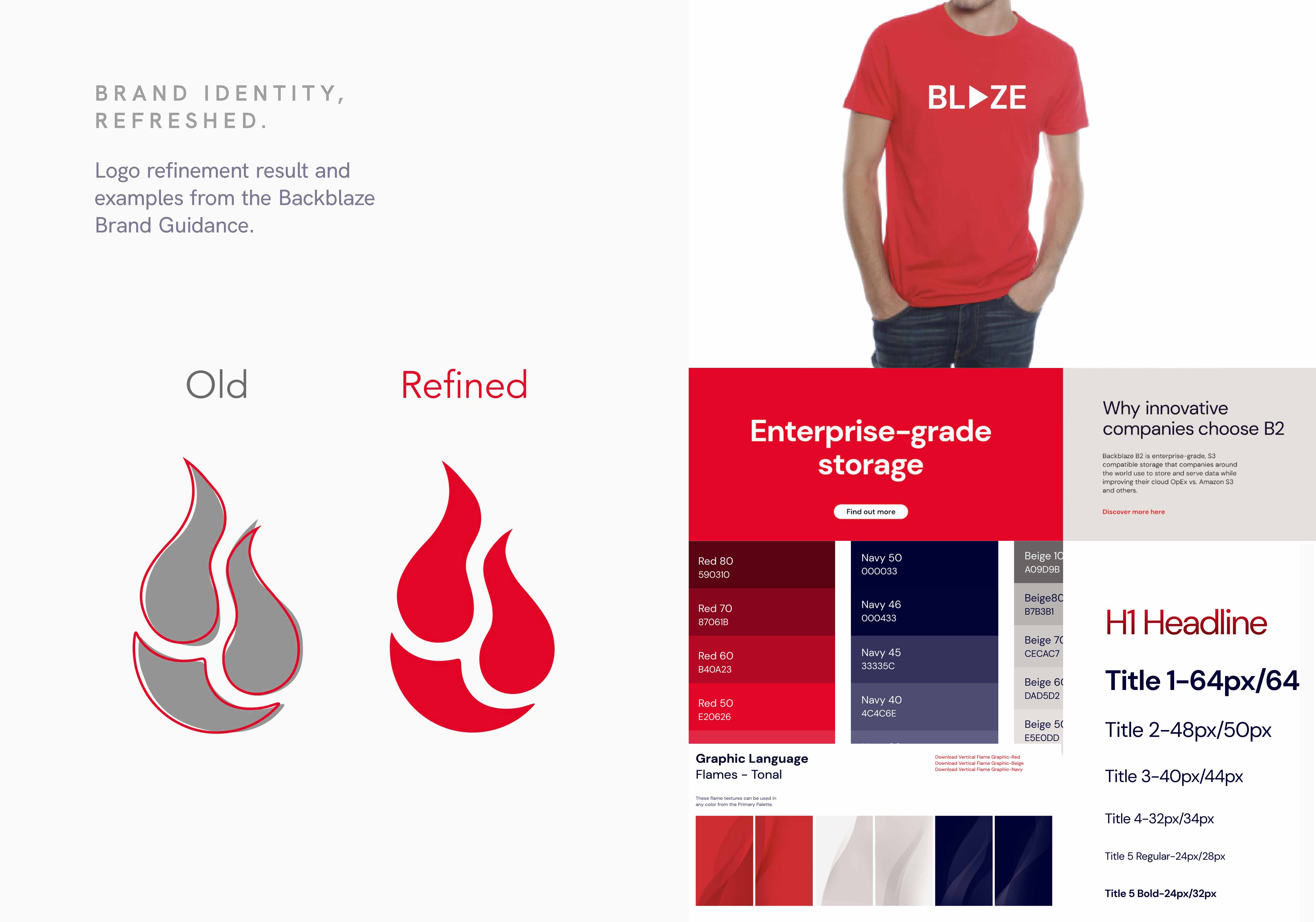
Brand System: Evolved the existing identity into a more mature and scalable system while preserving Backblaze’s recognizable red, approachable tone, and simple cloud-storage promise.
Brand Style Guide: Created and managed the Brand Style Guide to document logo usage, color, typography, illustration, iconography, layout rules, and digital brand standards so teams could apply the system consistently.
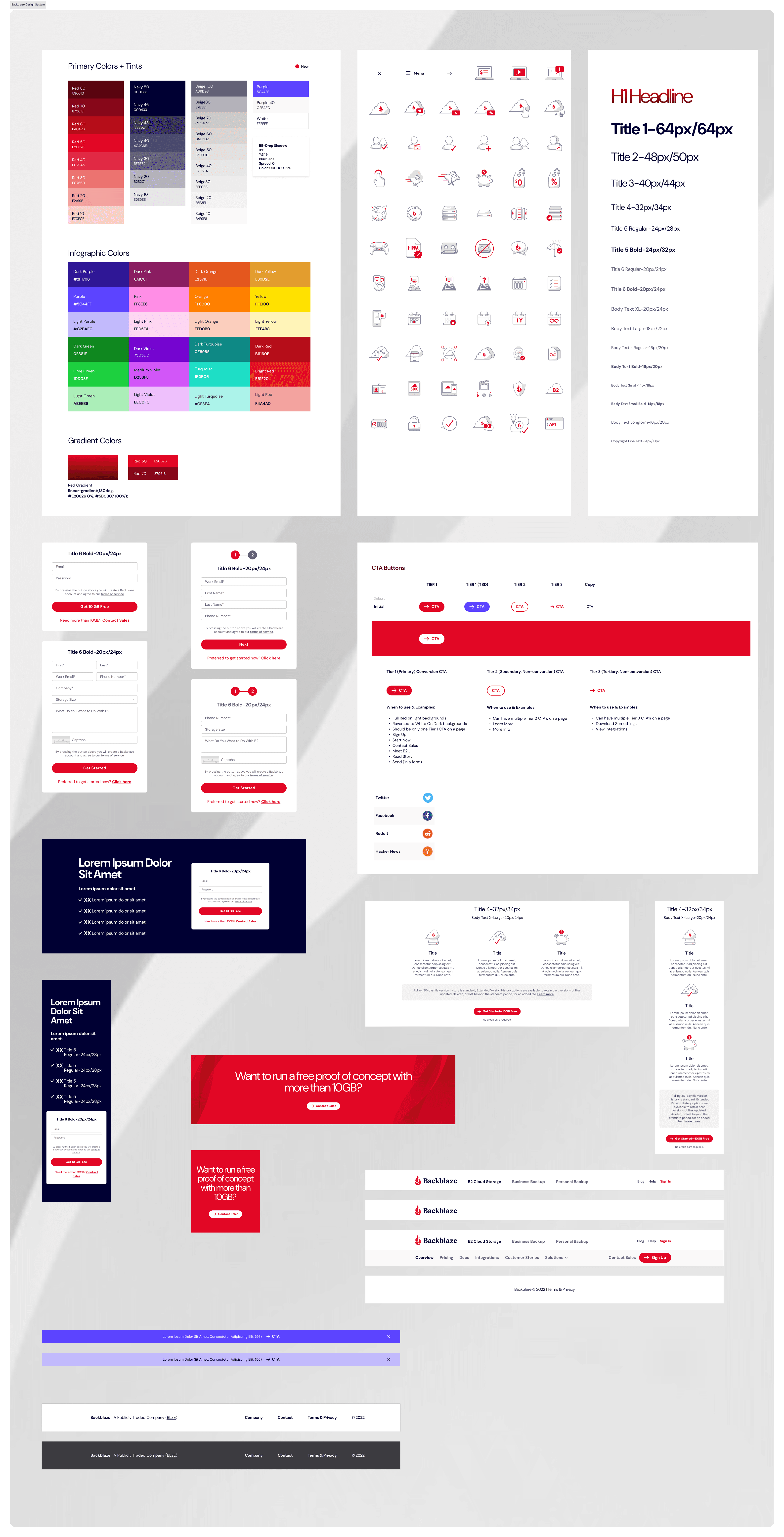
Visual Foundation: Defined color palettes, tints, gradients, typography, shadow styles, and visual rules that gave the brand a clearer system for digital use.
Component Library: Created reusable website patterns for CTAs, buttons, forms, proof-of-concept modules, content blocks, navigation, banners, footers, and responsive page sections.
Iconography & Illustration: Developed a consistent icon and illustration language to explain cloud storage, backup, files, infrastructure, security, and product benefits in a friendly but credible way.
Website Design System: Translated the rebrand into practical web patterns so teams could design and ship consistent marketing pages, conversion flows, and campaign experiences faster.
Key Decisions
Preserve equity while adding maturity. The system did not start from scratch. It refined the existing brand so Backblaze could feel more enterprise-ready without becoming generic or overly corporate.
Make powerful cloud storage feel simple. Every visual and UX pattern supported the core brand idea: cloud storage should feel easy to understand, human in tone, and powerful underneath.
Create repeatable conversion patterns. CTA tiers, forms, proof-of-concept modules, and contact flows gave teams consistent ways to guide visitors toward signup, sales, and lead-generation actions.
Systematize the visual language. Color, type, icons, buttons, navigation, banners, and layouts were organized into a repeatable system so future pages could feel cohesive.
Balance trust and approachability. The system added polish and enterprise credibility while keeping the whimsical, human qualities that made the brand distinct.
Core Product Loop

Backblaze
Cloud Storage Brand & Design System
Brand and Web Design System
UX/UI
Overview
Creating a scalable brand and design system for Backblaze’s enterprise growth
Backblaze is a cloud data storage company that needed a more mature brand and design system as it expanded from consumer success into the enterprise market and prepared for IPO. I helped evolve the founder-built identity into a scalable digital system that made powerful cloud storage feel simple, trustworthy, and enterprise-ready.
Challenge
Backblaze had built strong recognition in the consumer market over 12 years, but the company needed to improve how it was perceived by enterprise buyers. The challenge was to mature the brand without losing the simplicity, friendliness, and visual equity that made Backblaze recognizable.
The company also needed a system that could support growth across website pages, campaigns, lead-generation flows, product storytelling, CTAs, forms, navigation, icons, and conversion moments. The work needed to create consistency while helping the brand feel more credible for a new market.
What I Did
Brand System: Evolved the existing identity into a more mature and scalable system while preserving Backblaze’s recognizable red, approachable tone, and simple cloud-storage promise.
Brand Style Guide: Created and managed the Brand Style Guide to document logo usage, color, typography, illustration, iconography, layout rules, and digital brand standards so teams could apply the system consistently.
Visual Foundation: Defined color palettes, tints, gradients, typography, shadow styles, and visual rules that gave the brand a clearer system for digital use.
Component Library: Created reusable website patterns for CTAs, buttons, forms, proof-of-concept modules, content blocks, navigation, banners, footers, and responsive page sections.
Iconography & Illustration: Developed a consistent icon and illustration language to explain cloud storage, backup, files, infrastructure, security, and product benefits in a friendly but credible way.
Website Design System: Translated the rebrand into practical web patterns so teams could design and ship consistent marketing pages, conversion flows, and campaign experiences faster.
Key Decisions
Preserve equity while adding maturity. The system did not start from scratch. It refined the existing brand so Backblaze could feel more enterprise-ready without becoming generic or overly corporate.
Make powerful cloud storage feel simple. Every visual and UX pattern supported the core brand idea: cloud storage should feel easy to understand, human in tone, and powerful underneath.
Create repeatable conversion patterns. CTA tiers, forms, proof-of-concept modules, and contact flows gave teams consistent ways to guide visitors toward signup, sales, and lead-generation actions.
Systematize the visual language. Color, type, icons, buttons, navigation, banners, and layouts were organized into a repeatable system so future pages could feel cohesive.
Balance trust and approachability. The system added polish and enterprise credibility while keeping the whimsical, human qualities that made the brand distinct.
Core Product Loop
Backblaze
Cloud Storage Brand & Design System
Brand and Web Design System
UX/UI
Overview
Creating a scalable brand and design system for Backblaze’s enterprise growth
Backblaze is a cloud data storage company that needed a more mature brand and design system as it expanded from consumer success into the enterprise market and prepared for IPO. I helped evolve the founder-built identity into a scalable digital system that made powerful cloud storage feel simple, trustworthy, and enterprise-ready.
Challenge
Backblaze had built strong recognition in the consumer market over 12 years, but the company needed to improve how it was perceived by enterprise buyers. The challenge was to mature the brand without losing the simplicity, friendliness, and visual equity that made Backblaze recognizable.
The company also needed a system that could support growth across website pages, campaigns, lead-generation flows, product storytelling, CTAs, forms, navigation, icons, and conversion moments. The work needed to create consistency while helping the brand feel more credible for a new market.
What I Did
Brand System: Evolved the existing identity into a more mature and scalable system while preserving Backblaze’s recognizable red, approachable tone, and simple cloud-storage promise.
Brand Style Guide: Created and managed the Brand Style Guide to document logo usage, color, typography, illustration, iconography, layout rules, and digital brand standards so teams could apply the system consistently.
Visual Foundation: Defined color palettes, tints, gradients, typography, shadow styles, and visual rules that gave the brand a clearer system for digital use.
Component Library: Created reusable website patterns for CTAs, buttons, forms, proof-of-concept modules, content blocks, navigation, banners, footers, and responsive page sections.
Iconography & Illustration: Developed a consistent icon and illustration language to explain cloud storage, backup, files, infrastructure, security, and product benefits in a friendly but credible way.
Website Design System: Translated the rebrand into practical web patterns so teams could design and ship consistent marketing pages, conversion flows, and campaign experiences faster.
Key Decisions
Preserve equity while adding maturity. The system did not start from scratch. It refined the existing brand so Backblaze could feel more enterprise-ready without becoming generic or overly corporate.
Make powerful cloud storage feel simple. Every visual and UX pattern supported the core brand idea: cloud storage should feel easy to understand, human in tone, and powerful underneath.
Create repeatable conversion patterns. CTA tiers, forms, proof-of-concept modules, and contact flows gave teams consistent ways to guide visitors toward signup, sales, and lead-generation actions.
Systematize the visual language. Color, type, icons, buttons, navigation, banners, and layouts were organized into a repeatable system so future pages could feel cohesive.
Balance trust and approachability. The system added polish and enterprise credibility while keeping the whimsical, human qualities that made the brand distinct.
Core Product Loop